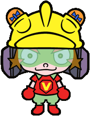
Why do 9-Volt and Kat&Ana look thicc AF?
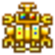
They all have that chubby baby look...

OH NICE AND CHUBBY BABY
upload_2018-3-9_10-22-10.png
 
Sonic fan base? Hopefully not yet. The reason why Sonic's fans are so crazy is because SEGA kept releasing wildly different games that took Sonic into bizzare and radically different directions as well as sparatic rises and drops in quality. The fanbase started eating itself alive because of this, developing different factions that could never agree. SEGA created that beast.

Hopefully that will never happen to Wario.
 
Is there really voice acting in the game though? Or is it just a promotional thing? The "cutscenes" look like they've been thrown together in a minute, honestly...

https://www.businesswire.com/news/h...uper-Smash-Bros.-Series-Heads-Nintendo-Switch

WarioWare Gold is the biggest entry in the series. And for the first time, the game includes fully voiced characters. WarioWare Goldlaunches exclusively for the Nintendo 3DS family of systems on Aug. 3.
 
Negatives:
  • Looks ugly
  • Looks slow
  • Sounds really lax (where's the bounciness of past games?)
Honestly, it's bittersweet. I hope the trailer is just kinda not giving the game justice. As I mentioned before, even Game & Wario looked better.

I agree with the look of the thing. Wario and some of the presentation looks stiff and crudely designed compared to past games. Still, I love that classy title "WarioWare Gold".
 
My personal thoughts:

1)Im okay with to get it on 3DS, even if Switch gets more and more popular.

2)Voice acting. Not a biggest thing, but Im glad its hapening.

3)Title is pretty gold... I mean, good. Its sounds like WarioWares own take on DX, X, Ultimate Edition, you get it.

4)New designs. Okeh!

5)Classic microgames looking better than originals (At least for me). Same for soundtrack

6)I remember, how they said, that you need to think fast of how microgame controls: Buttons, tilt, mic or touchscreen. How exactly should I know when to use touchscreen, if its not multitouch and requires stylus. Maybe I misheared something, but they doesnt seem to give you hint BEFORE microgames start like in Wii version.

Speaking of Buttons, tilt, touchscreen and mic:

4)Mixed-up controls: using Button from 1-st stage, sometimes using gamepad like in twisted (gyroscope) from 2-nd stage, touchscreen ( touching from one of 3 3rd levels, dragging from 4-th level, swapping from one of 3 5-th levels) and mic using from 6-th. Reminds something? Because its control changing like in wii version, but styled for original trilogy.

This is my post from a year ago.

Senpai noticed me?:CGasp:
 
Last edited:
Some of these character designs would have been totally rejected from my teachers in graphic design school. They look exactly like the novice pen tool exercises we did in Adobe Illustrator early in first year. Just look at those thick, black outlines running right through every detail... Don't want to bring the mood down, but good gravy...
 
Last edited:
These character designs would have been totally rejected from my teachers in graphic design school. They look exactly like the novice pen tool exercises we did in Adobe Illustrator early in first year. Just look at those thick, black outlines running right through every detail... Don't want to bring the mood down, but good gravy...
It's not the fault of the thicc lines. The other artworks have thicc lines too.
But here... the shapes... are just.... nooooo. :S<:[: This is not WarioWare artwork... this is Takeuchi doing fan art and putting it in the game.
upload_2018-3-9_17-14-10.png
Kat_and_Ana_WarioWare_Mega_Microgames.png
KatAnaGW.png

Now I miss the Game & Wario designs.
97_-3-.png
 
It's not the fault of the thicc lines. The other artworks have thicc lines too.
But here... the shapes... are just.... nooooo. :S<:[: This is not WarioWare artwork... this is Takeuchi doing fan art and putting it in the game.
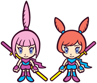
View attachment 6421
Kat_and_Ana_WarioWare_Mega_Microgames.png
KatAnaGW.png

Now I miss the Game & Wario designs. View attachment 6422

You are right. Kat and Ana look like elderly grannies with baby faces. Even G&W did a better job at this.
 
While people critisize new designs, I will say how boring Logo looks...
images

Nah, they will change it.

Looks pretty smart and professional to me. Why shouldn't corporate suits get to enjoy WarioWare, too?

@ShyGuyXXL The shapes, yes, but the old designs used moderation and spacing in their lining. Look at that line surrounding the "V" on 9-Volt's shirt... It dominates the whole torso, and is something I'd never slip past quality control at uni. The lack of line variation looks cramped and amateurish.
 
Last edited:
Back
Top