

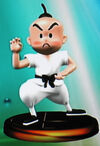
To me,i got totally downed after i saw 9-Volt's trophy in Smash 4.
Why??? Beacuse is MOTHERFUCKIN 2D!!!!
(Sorry,I need to chill.)
Why??? Beacuse is MOTHERFUCKIN 2D!!!!
(Sorry,I need to chill.)
I guess they thought putting the extra effort for Warioware characters wasn't worth it, so just gave them their 2d Artwork.
Yeah that's what I'm getting at they used to do that in melee but not anymore. The advance wars assist trophy is another example of the 2D treatment.Melee made a ton of trophies for characters that had only ever been 2D.
Sure, some of them looked a bit.... "off"...
...but the fact that they made them at all should be commended.
Melee made a ton of trophies for characters that had only ever been 2D.
Sure, some of them looked a bit.... "off"...
...but the fact that they made them at all should be commended.
Sort them all "By Category". There's your answer.Yeah, playable characters, items, assist trohpies and enemies - basically anything that already has a 3D model is pretty much guaranteed to be a trophy.
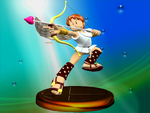
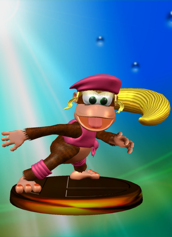
To add to that, The mother series has portrayed their characters with clay models and that's exactly what Poo looked like. So they are both correct.I never thought that Pit trophy looked off. That was his classic design.
It's not the designs themselves that look off to me. It's more so the... material? The quality of the models themselves? I'm not sure how to describe it.To add to that, The mother series has portrayed their characters with clay models and that's exactly what Poo looked like. So they are both correct.
.jpg/revision/latest?cb=20090913155638)
.jpg/revision/latest?cb=20090913153430)
It's not the designs themselves that look off to me. It's more so the... material? The quality of the models themselves? I'm not sure how to describe it.
Lemme try and get a better example...
Ah, here:
Of course, Meta Knight's design is different from today's but doesn't the 3D model itself also look cheap? Like it's made of cheap plastic?
Like a bootleg Meta Knight, basically.
I mean... am I alone on this?
Do these not look weird to anyone else?
Maybe it's because I didn't grow up with them.
Yeah, I hated that. It's like everything had to look like it came out of Twilight Princess. On 9 out of 10 characters that... Just. Does. Not. Work.Just like everything in Brawl nowadays looks ridiculously overtextured and gritty (looking at you, Bowser and Toon Link).

I agree with everything you say, and it's one of the reasons I didn't like brawl. (There are many reasons as to why i hate it.)Yeah, I hated that. It's like everything had to look like it came out of Twilight Princess. On 9 out of 10 characters that... Just. Does. Not. Work.
I'm all for adding detail to simple characters when it works... but when it doesn't it really doesn't.
Putting realistic denim textures on the overalls of a cartoon character... it doesn't mesh well. The cartoony proportions and simple textures are meant to be abstract representations of real life. You can't make some parts of it realistic while keeping other stuff stilistic.
At least they didn't make EVERY texture tealistic.
Otherwise you'd end up with something like this:

Eeeuugh~
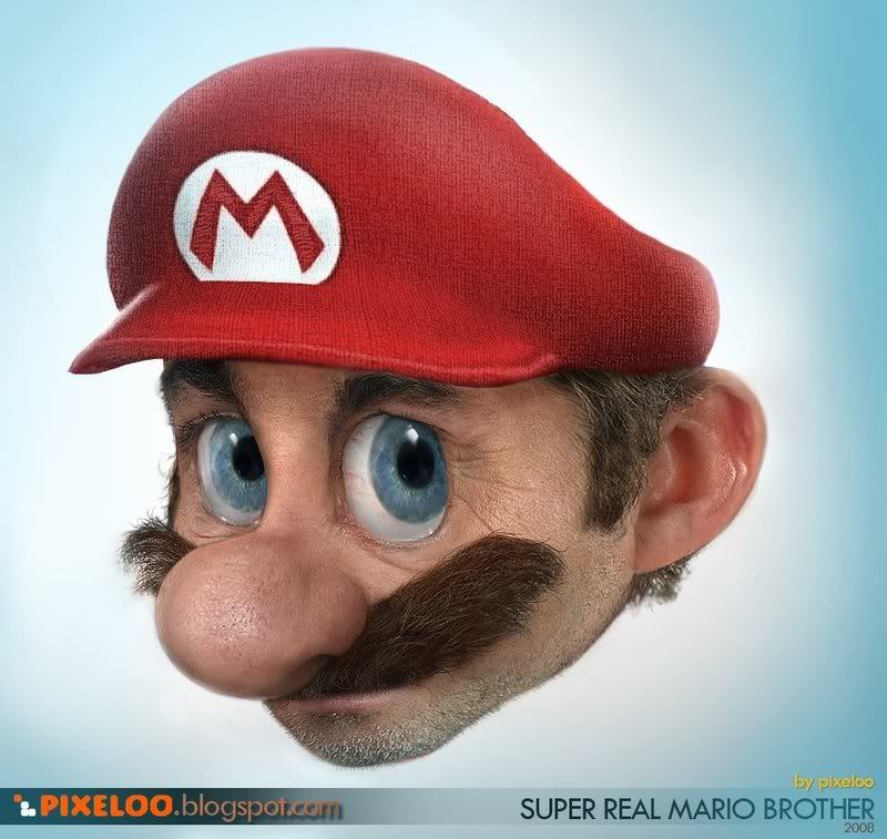
Edit: It's like when I watched the Good Dinosaur. Everything looked realistic, except for the dinos and humans which looked like cartoon characters with realistic textures. It did not work. It would've looked much better with a stylized look.
I just wanted to show what happens when you go overboard with realism and detail on a cartoon character. It looks more and more ridiculous.Also that realistic Mario picture is very overrated in terms of creepiness in my opinion.