Bad/Weird Wario artwork?

TB100

What you see is what you get, just a guy...
Now Wario and his friends has had a varity of artwork over the years,
And some are really memorable and eye catching.
250px-Wario_MP10 (1).png

warioware_cast.jpg

200px-WLSSyrup.png

WL2_WarioAttack.png

But we're not talking about those today.
Instead, we are gonna talk about the weird, bizzare and even bad side of Wario art.

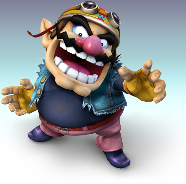
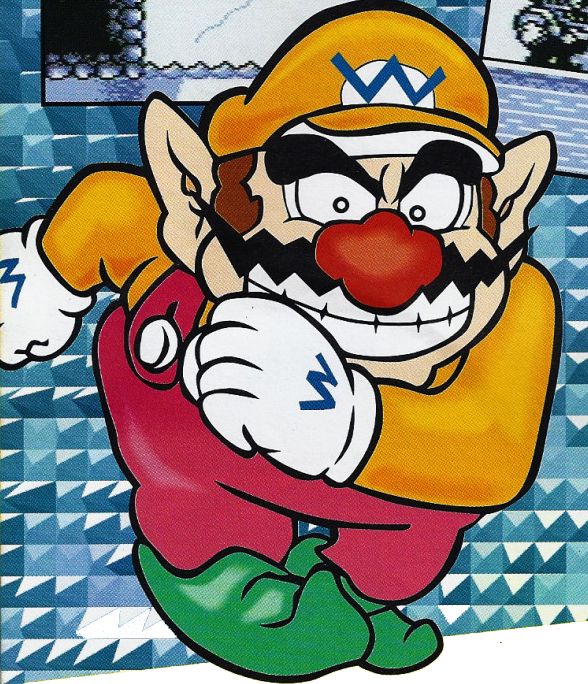
So lemme begin with this gem.
MH3on3_Wario.jpg

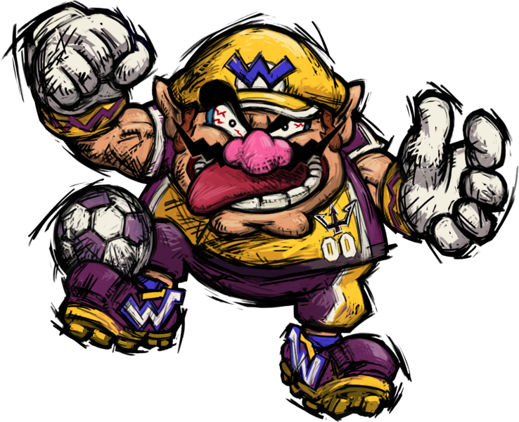
Seriously what the hell is up with this art, the random lines, the odd shading, and his weird as F expression (Seriously who makes that face when playing Basketball?) now I generally love the Artwork for Mario Hoops 3 on 3, but this.....?
It just looks off to me.

So do you have any Bad and/or weird Wario art that you want to show off? Well post them for all the world to scratch their heads and say WTF?

Though it should be official artwork only
And yes Sprites and stuff like that can count too if you want to talk about them.
 
I decided to take a look at the Wario gallery of Mario Wiki and one of the first things I found was this picture of Wario enjoying his ice cream way too much:
120px-SML2_Artwork_-_Wario_Alt_4.png


And though I like the style of SNES Wario's Woods this ¨Don't fuck with me, boy¨-attitude looks somewhat out of character to me.
WarioWoodsSprite.gif


While this artwork isn't weird or bad at all, it's still a bit strange that Wario looks much younger in this one than in any other game. (Except for Yoshi's Island DS of course.)
Mnsp-wario.png
 
Card_RareHorseRacing_Wario.png

I guess I just find this one very weird to look at, because Nintendo has recyled and updated this particular Wario render so many damn times, that it becomes very easy to tell when it's mildly edited. Not to mention just how easily you can tell that it's just an existing slightly changed Wario render, pasted next to the horse, instead of something that was made to actually make this look natural.
 
MarioLand2Wario.png

Looks square-ish in comparasion of Wario's Woods version
Warioshake.jpg

ItadakiWario.PNG

For some reason, both have the same exact eyebrows, the one below was released one year before Wario Land Shake it.
 
Card_RareHorseRacing_Wario.png

I guess I just find this one very weird to look at, because Nintendo has recyled and updated this particular Wario render so many damn times, that it becomes very easy to tell when it's mildly edited. Not to mention just how easily you can tell that it's just an existing slightly changed Wario render, pasted next to the horse, instead of something that was made to actually make this look natural.

Nintendo obviously doesn't care about Wario anymore. It's sad
 
Nintendo obviously doesn't care about Wario anymore. It's sad
A Wild blanche appears!
Personally I don't see this case in particular as Nintendo not caring about Wario as Mario Sports Superstars was full of lazy artwork.
Just look at these cards for example.
MarioSportsSuperstars-AmiiboCard-Five.jpg

Mario is using artwork from Super Mario Sluggers
mario_super_sluggers_conceptart_LhMO1.png

Bowser is using artwork from DDR Mario mix of all places.
Bowser_breakdancing.png


Peach is using artwork from Mario Tennis: Open
9e527a986ac28b91a295042a6445bb46.jpg

And Luigi's artwork is from Mario Golf; Toadstool Tour
images (7).jpg

Now I understand that it's a very common practice to reuse old artwork and for the most part, i'm fine with it.
However Mario Sports Superstars has a ton of new renders that makes the old artwork look extremely out of place. (Daisy's card has her new artwork which clashes pretty badly with the old artwork.)
H2x1_3DS_MarioSportsSuperstars.jpg

So I can't really see this in particular as a case of Nintendo not caring about Wario
As everything about Sports Superstars aside from the new artwork is pretty lazy and full of non care for the most part.

Though it is very sad to see Wario's current treatment by Nintendo.
 
Last edited:
Back
Top