


I'm starting to notice a trend with Nintendo that I'm not fond of. It started when I saw the menus and icons on the Nintendo Switch itself. Very flat, no colors, no music... Barebones and basic. I figured "Oh well, they'll probably have themes you can download later."
Then I played Breath of the Wild and saw how flat, basic, and minimal the menus were. The title sceen has no music. The file select is flat black boxes. Okay look at this:
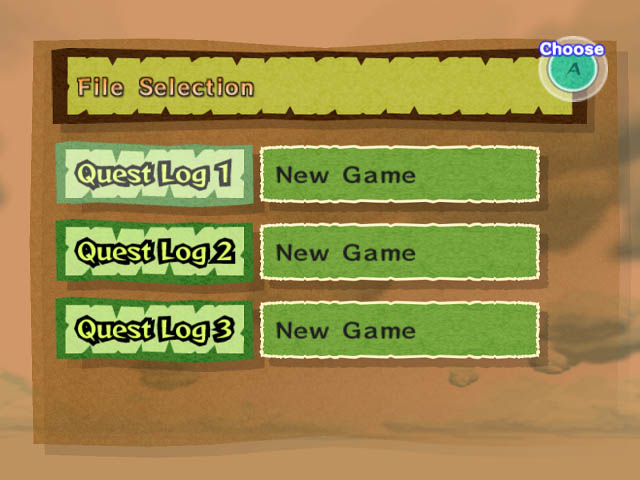
This is the Wind Waker's file select. Very stylistic.
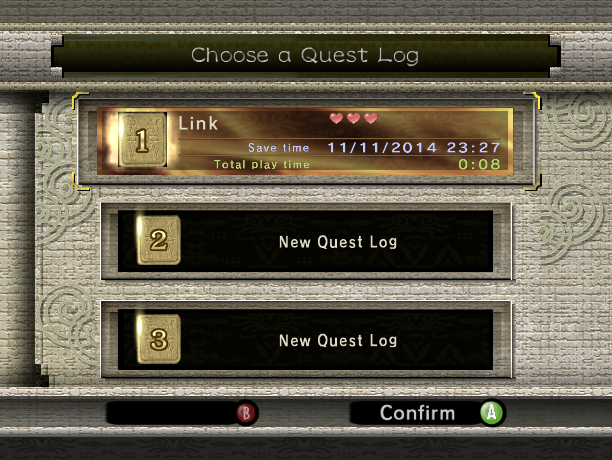
Here's Twilight Princess... very elegant.
I was used to seeing stuff like this from Nintendo. Why did Breath of the Wild get rid of that? So I thought maybe it was just Breath of the Wild. After all it's just one game. But then I saw footage of Super Mario Odyssey and saw something shocking!
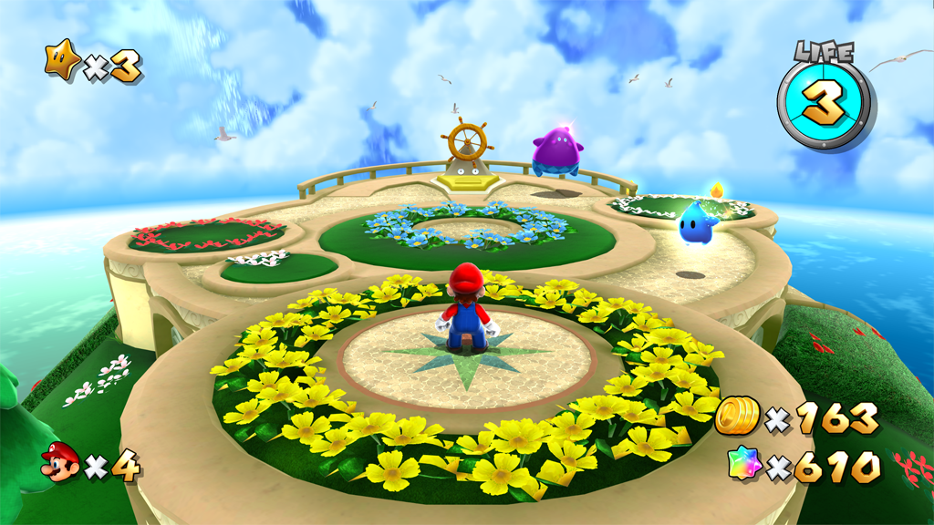
This is the HUD in Galaxy 2...
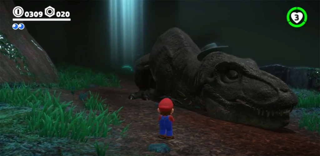
This is the HUD in Odyssey...
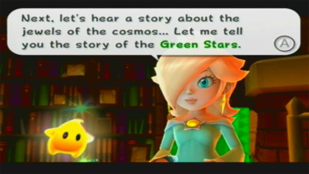
This is what a speech bubble looks like in Galaxy 2...
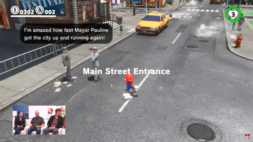
This is what a speech bubble looks like in Odyssey...
And finally this is what it looks like when you get a Star...

And this is what it looks like when you get a Moon...

Yeesh! What happened? Why did Nintendo decide to go bland, flat, and minimalistic with UI and HUD?
Is this a new thing with them? Will the next Donkey Kong game have menus and icons as basic as these? What do you think?
Then I played Breath of the Wild and saw how flat, basic, and minimal the menus were. The title sceen has no music. The file select is flat black boxes. Okay look at this:
This is the Wind Waker's file select. Very stylistic.
Here's Twilight Princess... very elegant.
I was used to seeing stuff like this from Nintendo. Why did Breath of the Wild get rid of that? So I thought maybe it was just Breath of the Wild. After all it's just one game. But then I saw footage of Super Mario Odyssey and saw something shocking!
This is the HUD in Galaxy 2...
This is the HUD in Odyssey...
This is what a speech bubble looks like in Galaxy 2...
This is what a speech bubble looks like in Odyssey...
And finally this is what it looks like when you get a Star...
And this is what it looks like when you get a Moon...
Yeesh! What happened? Why did Nintendo decide to go bland, flat, and minimalistic with UI and HUD?
Is this a new thing with them? Will the next Donkey Kong game have menus and icons as basic as these? What do you think?