[Poll] Did you like the visual style in Game & Wario?

Did you like the graphics style change in Game & Wario?

  • Yeah, I thought it was better than before

    Votes: 2 25.0%
  • It was okay

    Votes: 6 75.0%
  • No, I didn't like it much.

    Votes: 0 0.0%

  • Total voters
    8

CM30

Diamond City Mayor
Diamond City Leader
Because as you'll probably remember, they changed it quite significantly compared to the other WarioWare games.

For instance, most of the characters seem to have strange looking black eyes now:

269px-MonaGameWario.png


448px-9voltGW.png


KatAnaGW.png

AshleyRedGameWario.png


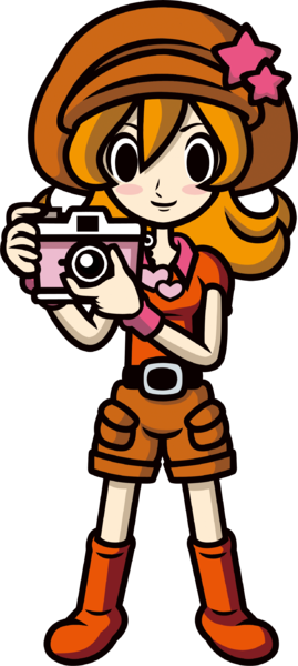
They also look a lot more like characters from Rhythm Heaven in general.

So what do you think about this change? Personally, I don't like it too much. Makes the series look less like a ... standard Wario game and too much like some attempt at an overly 'Japanese' art style.
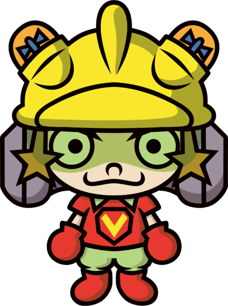
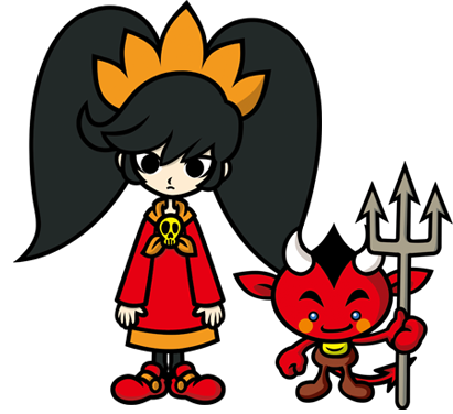
 
I don't particularly mind the new art direction, not even the much-maligned Mona redesign. Some characters benefit from it (Penny), some don't look particularly look different (Jimmy) and others look a bit worse (Kat & Ana).

I don't think it's a conscious change as much as it's an artist's style naturally changing and evolving overtime. If you look at Ko Takeuchi's recent art, they're lucky to even have a sclera, lol.
 
That's interesting (the change in the artist's general style), but it does make me wonder...

How come few other Nintendo games ever drastically change their art style in a game or two? Do the others have some sort of style guide that WarioWare doesn't? Because the only one I recall changing significantly is probably Mario & Luigi after the first title.
 
Back
Top