WarioWare Gold includes some changes to character designs. They are small (and can count as design changes or art style changes), but they are changes nevertheless.
Here are a few for comparison. (They're hi-res, so I put them in a spoiler section). Some characters have more Images than others, due to them having different variations. Quite a lot of them are from Game & Wario because that's the most recent game that's not WarioWare Gold.
All in all, most of the changes are to do with the art style. Every character looks less detailed, has no shading and are more rounded. Some of you might prefer this, but some may not! Let me know what you think in the Poll or in more detail if you prefer below! Personally, I prefer the older designs a little more than the newer ones, but the newer ones still look good and are distinct to this game.
Thanks!
Here are a few for comparison. (They're hi-res, so I put them in a spoiler section). Some characters have more Images than others, due to them having different variations. Quite a lot of them are from Game & Wario because that's the most recent game that's not WarioWare Gold.
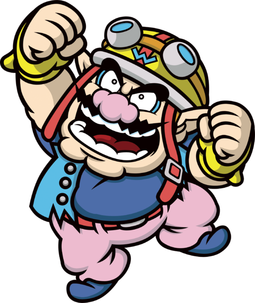
Game & Wario: Wario

WarioWare Gold: Wario (Looks very similar, just without shading, which is a recurring theme)
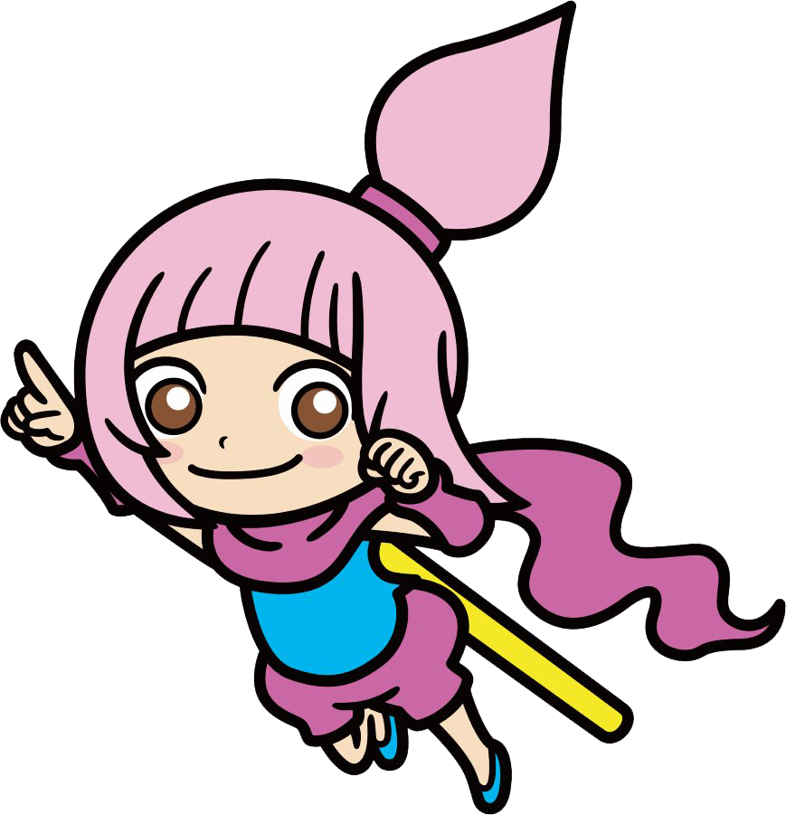
WarioWare DIY: Jimmy T.
Game & Wario: Jimmy T.
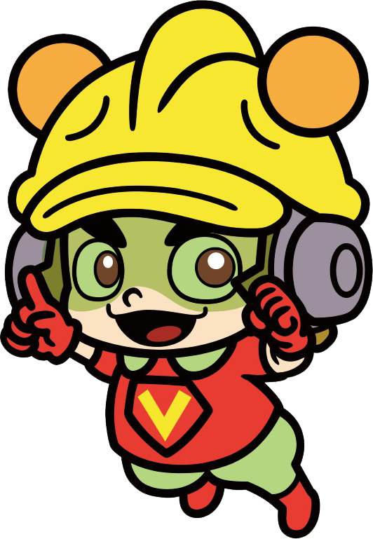
WarioWare Gold: Jimmy T. (Face looks different. His afro is more cloudy and bubbly. Mouth has changed)
WarioWare, Inc (GBA)/WarioWare, Inc (GCN).: Mona
WarioWare DIY: Mona
Game & Wario: Mona
WarioWare Gold: Mona (Face Shape looks different. Eyes & Mouth look different)
Game & Wario: 9-Volt
WarioWare Gold: 9-Volt (Eyes are brown now. More defined hands/fingers. Eyebrows are thicker. Missing weird siren things on hat. No star, Klonoa-looking things hanging from his hat)
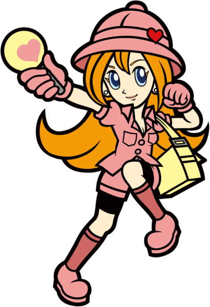
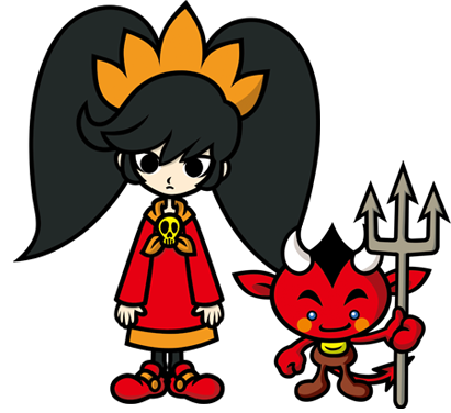
Game & Wario: Ashley & Red
WarioWare Gold: Ashley (Her face looks funny with that pose, ha ha.) (Face Shape is different. Looks a little younger and shorter)
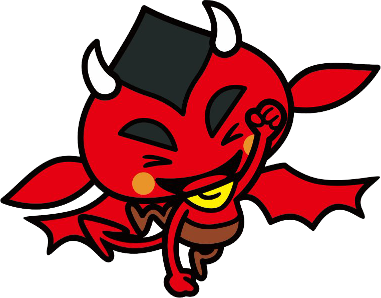
WarioWare Gold: Red (He has wings now! Looks a little wider)
Game & Wario: Kat
WarioWare Gold: (Eyes are brown now. Slightly different clothing. Different Face Shape)
Ana has the same changes.
You can view more of these changes for more characters with the following links (Thanks to the Super Mario Wiki for providing most of these images!):
WarioWare Gold Artwork:
WarioWare Gold - Super Mario Wiki, the Mario encyclopedia
Game & Wario Artwork:
Gallery:Game & Wario - Super Mario Wiki, the Mario encyclopedia
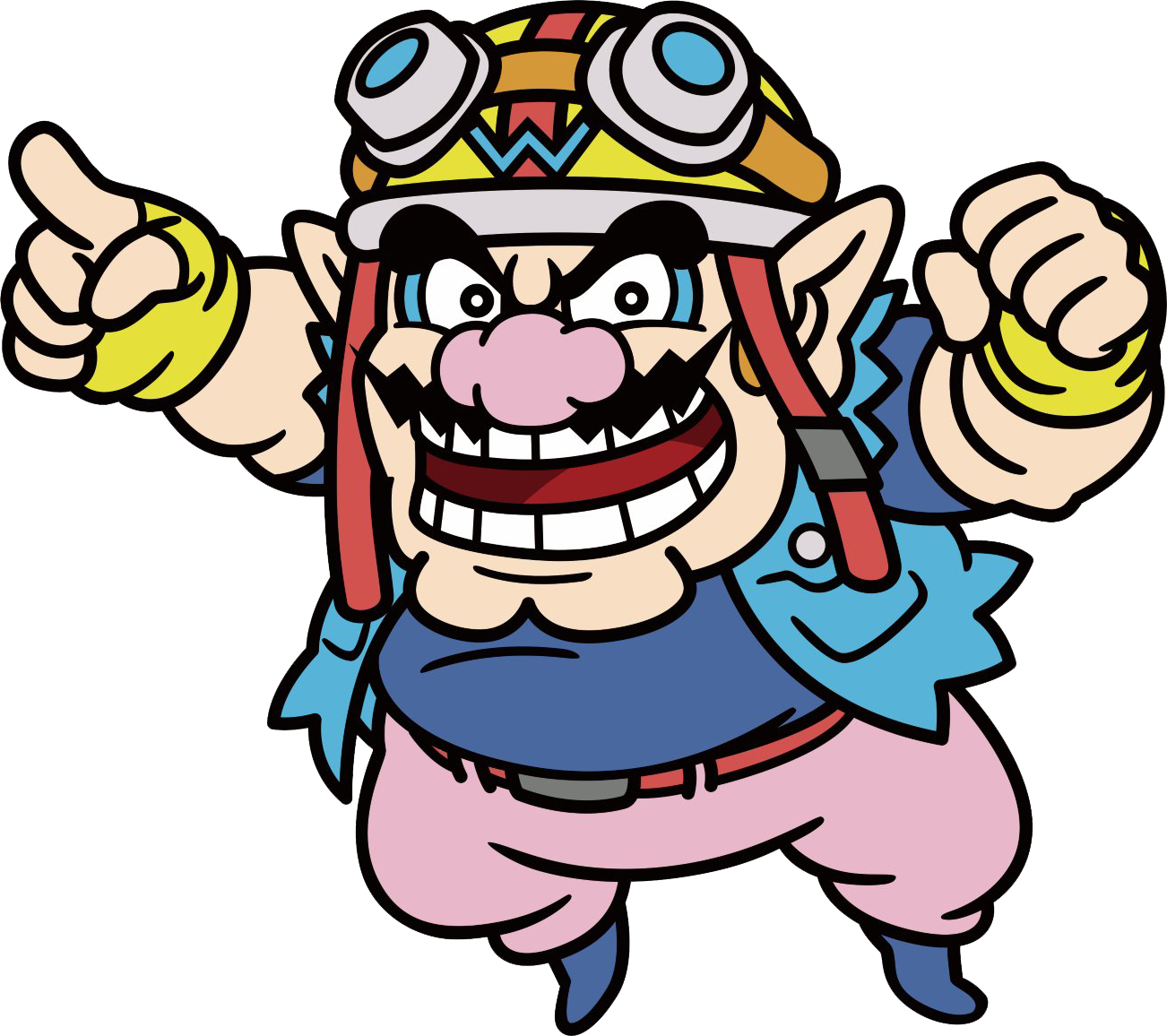
WarioWare Gold: Wario (Looks very similar, just without shading, which is a recurring theme)
WarioWare DIY: Jimmy T.

Game & Wario: Jimmy T.
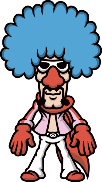
WarioWare Gold: Jimmy T. (Face looks different. His afro is more cloudy and bubbly. Mouth has changed)

WarioWare, Inc (GBA)/WarioWare, Inc (GCN).: Mona


WarioWare DIY: Mona
Game & Wario: Mona
WarioWare Gold: Mona (Face Shape looks different. Eyes & Mouth look different)

Game & Wario: 9-Volt
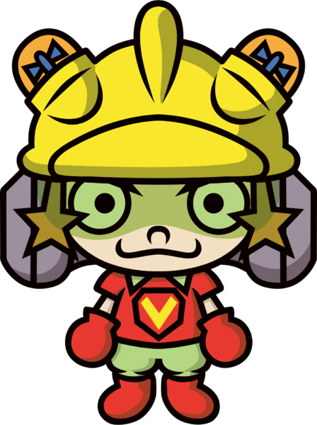
WarioWare Gold: 9-Volt (Eyes are brown now. More defined hands/fingers. Eyebrows are thicker. Missing weird siren things on hat. No star, Klonoa-looking things hanging from his hat)
Game & Wario: Ashley & Red
WarioWare Gold: Ashley (Her face looks funny with that pose, ha ha.) (Face Shape is different. Looks a little younger and shorter)

WarioWare Gold: Red (He has wings now! Looks a little wider)
Game & Wario: Kat
WarioWare Gold: (Eyes are brown now. Slightly different clothing. Different Face Shape)
Ana has the same changes.
You can view more of these changes for more characters with the following links (Thanks to the Super Mario Wiki for providing most of these images!):
WarioWare Gold Artwork:
WarioWare Gold - Super Mario Wiki, the Mario encyclopedia
Game & Wario Artwork:
Gallery:Game & Wario - Super Mario Wiki, the Mario encyclopedia
All in all, most of the changes are to do with the art style. Every character looks less detailed, has no shading and are more rounded. Some of you might prefer this, but some may not! Let me know what you think in the Poll or in more detail if you prefer below! Personally, I prefer the older designs a little more than the newer ones, but the newer ones still look good and are distinct to this game.
Thanks!