Your favorite "little things" in the WarioWare series

The tiny bits of hidden info in manuals and clear screens that show how Wario and Mona like each other.

Also it's probably not too little, but I enjoy how Wario's animosity towards Mario seeps into his mini games.

EDIT: Also, Crygor's name was on the fare meter in Dribble and Spitz cab. Implying that he either built or modified it for use of space travel.
 
Last edited:
In WarioWare Smooth Moves, on the third level of the Twisted microgame, when you flip the Wiimote over, and the guy's hat falls out of the gba on the tv screen. I have a video, but I can't show it because I don't have it posted on any site, only in a file. But it's not in the best quality anyway. But not potato quality. Just weird lighting.
 
In WarioWare Smooth Moves, on the third level of the Twisted microgame, when you flip the Wiimote over, and the guy's hat falls out of the gba on the tv screen. I have a video, but I can't show it because I don't have it posted on any site, only in a file. But it's not in the best quality anyway. But not potato quality. Just weird lighting.

Can you upload the file to the forums or something?
 
In Ashley's WarioWare Gold microgame, Power Outage,
Orbulon stuff! WOOOOOO!!
Pics taken from a sucky camera comin right up!
20180913_151935.jpg

That hand in the middle... That shape...

20180913_152305.jpg

I see him... Riding whatever animal that is... So sorry that the pic turned out sideways. I'd rotate it if I wasn't to lazy.

20180913_152152.jpg

Now he's up in the Oinker...

20180913_151903.jpg

And BOOM it's the boi
 
I like how a few of the microgames in WarioWare: Twisted! used character's voices as sound effects. Like in the first difficulty of Survival of the Quickest, when you win it has Mona's voice saying "Nice monkey!", Focus Pocus has her voice saying "Cool!", Wedgies! has Jimmy T. say "Oh yeah, par-tay!" and Safecracker has Dr. Crygor say "Very nice!".
Similarly, the WW inc. game over jingle had Jimmy's laugh at the end, which the 3DS version doesn't. And I miss it so much. S:(
Without it it just feels ...incomplete.
 
I liked how in the first game, with the two player games, you actually got to play as Mona, Dribble, Dr. Crygor, and Orbulon! I mean, how cool is that?! Also, I like how the first three games all have bright blue stars in a black background for the credits, which I'm sure is a reference to the Play-Yan GBA music player. Also, if you watch the full credits in the first game, there's different music when you go back to the menu screen.
 
I liked how in the first game, with the two player games, you actually got to play as Mona, Dribble, Dr. Crygor, and Orbulon! I mean, how cool is that?! Also, I like how the first three games all have bright blue stars in a black background for the credits, which I'm sure is a reference to the Play-Yan GBA music player. Also, if you watch the full credits in the first game, there's different music when you go back to the menu screen.

That they chose Mona and Dribble in VS Dong Dong is because of their respectively red and blue clothing.
Also, like how in the epilogue of Dribble & Spitz' story in Mega Microgames you can hear ¨Drifting Away¨ very faintly in the background, near the end.
 
One of my favorite things is the varying graphical styles and the inconsistent animation fluidity (see: 'Wario shaking apple tree' microgame vs "Sniff!" vs "Drip?"). However, I've never really been one for vector-type smoothing graphics (as seen in practically every WW title except for the first couple, to my displeasure), so this applies more so to the first three games than later titles. In other words, the pixel perfect graphics I think make for a better 'weird' type graphic, especially when photorealism gets involved. With the vector graphics it's like "oh okay this guy is a inky-outline blob man but hey look a .png of some lady's lips, that sure is wAcKy, who the hell thought this wouldn't clash," but with the pixels they're kind of forced to mesh together better, I think, because of the GBA's resolution. And, with said pixels you subconsciously feel like more effort was put in at least to some capacity, because shrinking an image to fit that screen without it becoming a complete mess is really difficult if you don't know what you're doing and
:woahalt:AAAAAAA I don't LIKE the Vector Graphics oKAAY?! they look HOMOGENOUS and UGLY and ALSO the animators don't have to TRY anymore (because vector automatically resizes its contents to keep its picture quality regardless of size or orientation) ohmygaa Wario running from the boulder his hands oh God that is AWFUL what is this Johnny Test nonsense and what is this ANIME VOICEOVERS?!?!?! Don't they know SUB OVER DUUUUB??!?!?!?! It feels so CHEAP and OOOOh I don't like it!

But yeah, I really like how they did every microgame with different pixel<--Hey Listen!: art styles

((Sorry to give off so many bad vibes on this good-ass thread, but it is literally my only gripe, that they went down this path in terms of art style. WW used to have that same vibe that Wario Land games give off with its graphics, with that art style being the one that every other style sort of revolved around/drew from, if that makes any sense, whereas now the style that is considered the default is just so boring and generic, and the designs for all the Wario characters, while cute as hell, don't look like they come from the same universe as Wario anymore, the way they used to. Even Jimmy T., man! The whole point of creating these characters and all this weird crazy goodness was so that Wario could belong somewhere, surrounded by other black sheep-- even Mona, the supposed 'normal' character, was drawn a bit oddly in the beginning (9-volt only looked the way he did because that's how cutesy child video game protagonists tend to look), but everything's so perfect and clean-cut now, it's-- EUGH. :wurgh: Where's the heart))
 
Last edited:
I also love that so many microgames got their own fleshed out themes. They're all 4 seconds long, granted, but they tend to have 4-5 instruments and DAMN if they aren't catchy as hell

(oh, and this is a recreation, technically, but it's close enough, right?)
 

Attachments

  • Escape!.mp3
    68.2 KB · Views: 386
Last edited:
One of my favorite things is the varying graphical styles and the inconsistent animation fluidity (see: 'Wario shaking apple tree' microgame vs "Sniff!" vs "Drip?"). However, I've never really been one for vector-type smoothing graphics (as seen in practically every WW title except for the first couple, to my displeasure), so this applies more so to the first three games than later titles. In other words, the pixel perfect graphics I think make for a better 'weird' type graphic, especially when photorealism gets involved. With the vector graphics it's like "oh okay this guy is a inky-outline blob man but hey look a .png of some lady's lips, that sure is wAcKy, who the hell thought this wouldn't clash," but with the pixels they're kind of forced to mesh together better, I think, because of the GBA's resolution. And, with said pixels you subconsciously feel like more effort was put in at least to some capacity, because shrinking an image to fit that screen without it becoming a complete mess is really difficult if you don't know what you're doing and
:woahalt:AAAAAAA I don't LIKE the Vector Graphics oKAAY?! they look HOMOGENOUS and UGLY and ALSO the animators don't have to TRY anymore (because vector automatically resizes its contents to keep its picture quality regardless of size or orientation) ohmygaa Wario running from the boulder his hands oh God that is AWFUL what is this Johnny Test nonsense and what is this ANIME VOICEOVERS?!?!?! Don't they know SUB OVER DUUUUB??!?!?!?! It feels so CHEAP and OOOOh I don't like it!

But yeah, I really like how they did every microgame with different pixel<--Hey Listen!: art styles

((Sorry to give off so many bad vibes on this good-ass thread, but it is literally my only gripe, that they went down this path in terms of art style. WW used to have that same vibe that Wario Land games give off with its graphics, with that art style being the one that every other style sort of revolved around/drew from, if that makes any sense, whereas now the style that is considered the default is just so boring and generic, and the designs for all the Wario characters, while cute as hell, don't look like they come from the same universe as Wario anymore, the way they used to. Even Jimmy T., man! The whole point of creating these characters and all this weird crazy goodness was so that Wario could belong somewhere, surrounded by other black sheep-- even Mona, the supposed 'normal' character, was drawn a bit oddly in the beginning (9-volt only looked the way he did because that's how cutesy child video game protagonists tend to look), but everything's so perfect and clean-cut now, it's-- EUGH. :wurgh: Where's the heart))

Sheesh, this site is literally such a pleasant environment that I actually feel a little guilty for going on that rant :orbulonoh:
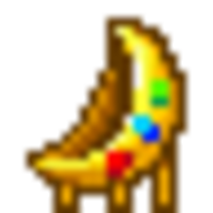
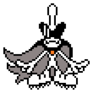
... but just look at the emojis we have for WarioWare. :dodgeboi:Surely there must be a reason why all but like two of them are from the games with pixel-centric art.
And another thing, take a look at the Dodgin' stick man! He's proof that pixel animation can be smooth as budduh moving around too, and because of the individual frames he has more personality while doing so to boot. I get that they had to cut costs and stuff, but that ink blob outline style we have now would look SOOOOOOOOOOOOOO much better if they put some effort into it-- you can't really get away with giving that sort of art style a "beep-bop-beep-bop" level of not-moving like you can with pixels, and the overly obvious tweening makes its animation feel like a high-end iPhone game, almost, and God does that pain me to say.

...almost as much as listening to the voice acting in Gold does! Hey-o! (Except for Waaaaario of course, but even he sounded off his game-- obviously they didn't want-a him makin' the other voices look bad, wa-ha, ha... wah... get a voice director if you're going to have fully voiced cutscenes, I've heard better Wario voices than the one in Gold and that is scary)

GRANTED, this is not to say that I outright despise the art and stuff in newer entries-- just look at the Alien image from G&W posted this morning, that's gorgeously appealing to look at. It's only the main art style, for the main characters, that bugs me. Gold is the only one where it actually grated my nerves though, because the 3DS doesn't even have the resolution to support that kind of style without sacrificing some picture quality, and when you add the mediocre 'bababab' animation and okay-at-best-cringey-at-worst voice work it's just sad.

"Aren't muscles just the greatest?" Brrrr
 
Last edited:
In that one boss from the first game with the hammer and nail if you hit the nail off center you mess up the nail so you have to hit it dead center and keep it centered to beat the boss when they could have easily just made it that only matters that you hit the nail.
 
In that one boss from the first game with the hammer and nail if you hit the nail off center you mess up the nail so you have to hit it dead center and keep it centered to beat the boss when they could have easily just made it that only matters that you hit the nail.

I hated how they removed that in WarioWare Gold
 
I always liked that the Catch microgame had the dog howl (and wind too, if memory serves) in the background. It really added to the desolate atmosphere, and made it feel rather eerie.
 
I like the little bits of off-beat trivia you know from playing the games for so long. Like how Jimmy's hair is a wig and not his real hair. You may think that's common knowledge, but a friend of mine was talking to me the other day exclaiming that Jimmy's hair is fake. He was shocked when I told him his hair has always been a wig.
 
Back
Top