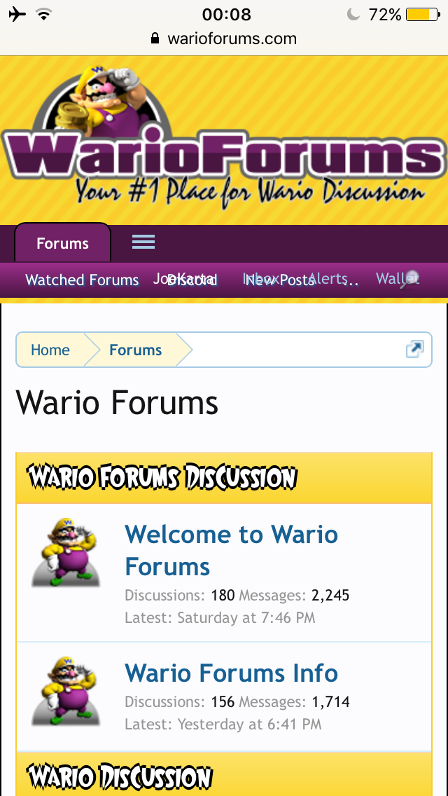
I've had this problem for a few years now, the alerts and account button always cover the new posts button which is really annoying.
Can this maybe be fixed somehow? Maybe make less options appears for the menu version or hide some options in a slide down menu.
Can this maybe be fixed somehow? Maybe make less options appears for the menu version or hide some options in a slide down menu.