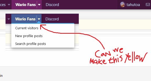
Sure, the home page is completely swathed in yellow, but what about everywhere else? My profile page feels cold without that little bit o' yellow in my life that the Given Reactions panel provided ;__;

Just, like, a nice sort of yellow that blends well, a little bit faded, a little bit pastel, just a shade that meshes. The blue up in the HUD for unselected tabs, the "attach files", "save/preview" all of that, that should stay, we just need yellow for highlighted shit in the HUD and a bit more heavily on the profile pages, like how they were colored before this last update, with the pastel yellows and oranges, so that we have a proper balance of the Holy Trinity of Wario colors again.
Granted, this isn't too big an issue, but they're called cool colors and warm colors for a reason. Nowhere feels as cozy as the title page anymore.
We're severely lacking in THE WAA COLOR in many places on the WAA FORUM
Last edited:


