Syrup's Design for What Could've Been

What colour scheme do you think should be used for Syrup's design in What Could've Been efforts?


  • Total voters
    15

ChanceTime

Wario Fan Supreme
Something that we're going to persist with as a project is What Should've Been, which is an effort to demonstrate what it'd have been like to feature Syrup into Mario games in place of Waluigi, as has been oft-written about before by us. Sadly we're not hacking geniuses and this'll only be in mocked-up art and videos, but it's better than nothing as far as proving a point goes. Something that I'm curious about though is what should be done about Syrup's design.

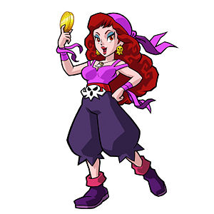
On occasion, with my own mock-ups people have brought to my attention that particular aspects to Syrup's design doesn't make chronological sense. For instance, her belt buckle was not a thing until Shake It, yet I included it on that Mario Party 2 image. I was wondering how much that means to people in general and whether there's any sort of sensible preference. Put it this way; Pretty much all of the games we'll covering are pre-Shake It!, and therefore the Black + Purple redesign did not yet exist. However, to my knowledge it's the more often recognised and preferred one, so how much does it matter as far as you guys are concerned?

Let me know if you'd rather see the videos feature her in WL2's Cyan+Yellow getup, or SI!'s Black+Purple one, and also any preferences regarding other design elements, such as the aforementioned belt buckle, or her pants-boots situation. The Purple+Black design has already featured in the Mario Hoops video, but that doesn't necessarily have to dictate the rest. Cheers.
 
I prefer her design from Shake It to be honest. So go ahead and use that one.

If people complain, say this:

How do we know she wouldn't use that design? It could have been made for a Mario sports spinoff instead of Wario Land Shake It, in an alternate universe where she replaced Waluigi.
 
I would go for the Cyan + Yellow from Wario Land 2 without scientific reasons.
I prefer her with this colours than the black and purple (even she cools pretty great with it).
 
The brighter colors would fit the upbeat mood of the series and the darker colors would go with the depressing side of Wario (and toilet humor) so whichever mood you want to appeal to I suggest you choose the colors of what you wanted to convey in your writing. I voted for the brighter colors because I wanted a tie and they look great (conspiracy theory Daisy is Captain Syrup).
 
The brighter colors would fit the upbeat mood of the series and the darker colors would go with the depressing side of Wario (and toilet humor) so whichever mood you want to appeal to I suggest you choose the colors of what you wanted to convey in your writing. I voted for the brighter colors because I wanted a tie and they look great (conspiracy theory Daisy is Captain Syrup).

Could be like how Wario has an overalls outfit and a biker outfit.
 
Purple? Cyan? Bah!
To me she will always be orange and white!
syrup.png

But seriously now, I'm not very familiar with the cyan design, I surely hadn't seen it as a child. Where did they even release that? In Wario Land 1's manual? I know that it wasn't in WL2's manual cuz I actually had that one as a child.
I had no idea she was supposed to look like that since WL1 was in black and white and in WL2 she was orange. I just assumed that if anything her outfit would've been white. *shrugs*

That said, I actually really like her Shake it design.
lovely_me_by_smb__captain_syrup.jpg

I think it all fits together really well.

But to be honest, looking at the cyan one...
Her hair fits the yellow parts well... but I don't think the cyan parts resonate well with her hair... and then the dark green boots just sorta ruin it...
Also her earrings blend in with her hair.... so they should've been yellow/gold too.
100px-Captain_Syrup.png


So yeah if I had to choose between those 2 - as much as I love the old games more than Shake it - I'd choose the new one.
 
Purple? Cyan? Bah!
To me she will always be orange and white!
View attachment 757
But seriously now, I'm not very familiar with the cyan design, I surely hadn't seen it as a child. Where did they even release that? In Wario Land 1's manual? I know that it wasn't in WL2's manual cuz I actually had that one as a child.
I had no idea she was supposed to look like that since WL1 was in black and white and in WL2 she was orange. I just assumed that if anything her outfit would've been white. *shrugs*

That said, I actually really like her Shake it design.
lovely_me_by_smb__captain_syrup.jpg

I think it all fits together really well.

But to be honest, looking at the cyan one...
Her hair fits the yellow parts well... but I don't think the cyan parts resonate well with her hair... and then the dark green boots just sorta ruin it...
Also her earrings blend in with her hair.... so they should've been yellow/gold too.
100px-Captain_Syrup.png


So yeah if I had to choose between those 2 - as much as I love the old games more than Shake it - I'd choose the new one.

I like the last one better.. better clothes and a more hourglass figure
 
Back
Top