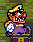
I've been noticing for a while now that Wario in WL4 has two different palettes. There's the one we all know and one where his skin color is more distinguishable from his shirt and hat colors.
I actually think it looks better on some ways. It's definitely easier to tell the colors apart.
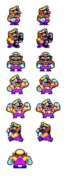
Here's a comparison:

Some sprites, like the one at the bottom here and the Wario Hop sprites use the second palette, but most just have the regular one.
This leads me to believe that this inconsistency might be due to a mistake.
Like, maybe the second palette was in the beta, but they thought it maybe looked to dark, so they changed it, but they didn't remember to change all the instances where the old one was used?
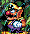
It's not quite the same as the beta palette, seen here:


This one's more desaturated.
So what do you think? Mistake? Inconsistency? Or just a strange artistic choice?
And which do you prefer?
I actually think it looks better on some ways. It's definitely easier to tell the colors apart.
Here's a comparison:
Some sprites, like the one at the bottom here and the Wario Hop sprites use the second palette, but most just have the regular one.
This leads me to believe that this inconsistency might be due to a mistake.
Like, maybe the second palette was in the beta, but they thought it maybe looked to dark, so they changed it, but they didn't remember to change all the instances where the old one was used?
It's not quite the same as the beta palette, seen here:
This one's more desaturated.
So what do you think? Mistake? Inconsistency? Or just a strange artistic choice?
And which do you prefer?


