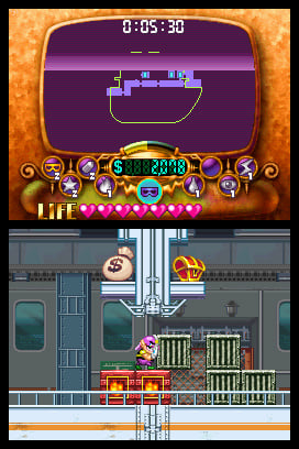
Best and worst graphics in a Wario game?

CM30

Diamond City Mayor
Diamond City Leader
And let's be fair and only count the story graphics for WarioWare titles, since most of the microgame ones are deliberately meant to be awful.

Personally, I'd say Wario Land 4 is probably the best looking title, at least as far as attention to detail and stuff goes. Sure, Shake It looked cooler, but there's a lot more neat details in Wario Land 4's levels, and the themes are better.

For worst, probably Master of Disguise. Or maybe World, at least as far as bosses/enemies go (Wario himself looks quite nice, as do the environments).

But what do you think?
 
I agree that Wario: Master of disguise didn't look too great. At least the character sprites. I dunno, I always thought Wario's Sprites looked more like ...custom sprites...I dunno. There was just something about them that felt off.

Wario Land 4 is indeed beautiful. Shake it also has great background art and animations but yeah, it wasn't quite as creative.

I think Wario World's graphics were a bit odd in the sense that many of the levels looked much more realistic than the cartoony cjaracters and monsters.
I think they could've been a BIT more cartoony. Not much though.

Some people may call the first Wario Land the worst but for GB standards ot looks really good. I really like that the characters and enemies are so big and expressive. I also love how doofy some of them look. Definitely the right direction to go with the series. :D

Wario Land 3 was really great for GBC standards. It's really clean and polished, great animations, great use of colors.

Does Mario & Wario count as a Wario game? :p Or Wario's Woods?
 
monasear.png

yeah i'm pretty sure inc has the worst graphics

sorry but mona's ears
 
Best: Super Mario Land 3, I think. I think this is the best-looking game I've ever seen on the original Gameboy. It's quite incredible, in my opinion.
I wouldn't know the worst, as I haven't actually played the lesser liked ones. So then I'd have to say Wario Land II, while it actually has pretty good graphics d:p
 
View attachment 1061
yeah i'm pretty sure inc has the worst graphics

sorry but mona's ears
Yeah, the game is full of weird looking sprites and mistakes, but to be honest, ...I like that. It's authentic. And I'm not just saying that ironically. :p
It adds charm in a way. Like how wario has a lot of different sprites that all look a little bit different, a lot of the close-ups look off, there plenty of strange perspectives...
I don't know why, but for some reason those mistakes don't make me like the game less.
 
I guess?

Alright if we miscount intentional lackluster quality then I'd say Wario World looks the worst if only for some of the character models.
 
WarioWare is kind of meant to look like something designed by amateurs. Because the characters in game are amateurs without much in the way of game design/development knowledge.
I'd say that applies for the microgames (a lot of them are indeed very simple in terms of graphics) but not for the stuff outside the microgames. ...unless the cutscenes aren't supposed to be real events but were animated by the WW crew themselves. :S8V:
 
  • Agree
Reactions: 607
I feel Master of Disguise has spritework that ranges from uninspired to fugly

gfs_82392_1_35.jpg


large.jpg


Wario-Master-of-Disguise-Screenshot-5.jpg


I'm not a visual artist or an intelligent person, so I can't really elaborate on what I find terrible about MoD. It just looks bad.
 
Funnily enough I never considered MoD as particularly bad-looking at all, decent, at least. I hate the controls and design of MoD but I don't think I've ever thought the game's graphics were as lacking.
 
Yeah, I'd have to cast my vote for Master of Disguise. Wario World looks okay at best, but Master of Disguise is just awkward to look at.
 
As a quick offshoot in regards to the graphics, one of the most interesting mixed bags to me is WL2. Playing it on the GBC makes the graphics look really nice without much to dwell on, but on original GB hardware it's a more complicated story.

Giving Wario the light outline around him in the GB version was a really good move and helped ensure that he popped out when working with the much smaller amount of colours on screen. In general with the limitations in mind I think the game looks great. However, what I do have a problem with is in regards to the game when played on the Super Game Boy.

WL2_SuperGameboyBoarders_zps2fa99faf.png

Image courtesy here

Now, the borders rendered on the Super Game Boy are absolutely lovely and help with the engagement of the game given that they link in with the level you're on. The problem I have is the washed-out colour choices on the special palettes given to you on the SGB. Other than in cases like the title screen or DD minigame there, the overall look is very dull and the colours don't stand out as well as they should. As opposed to giving the game some colour as is the intention behind the SGB's existence, playing WL2 on it feels akin to playing it with a greyscale palette with a tint splashed over it.

This wouldn't be too much of a problem if you could edit the palette yourself as is possible with the vast majority of games that work on the SGB, but for some reason with WL2 in particular this feature has been disabled for some dumbass reason. What makes it so frustrating is how great a job Donkey Kong '94 did with palette choices to make all the colours stand out, and how dulled WL2 looks by comparison. Even the palette suggestions in the SGB's guide for WL1 did a better job in having a colour scheme that popped nicely for each world. Mind you even then Donkey Kong Land fares a whole lot worse; unless you're playing in a way where you can seperate the sprite and background palettes, trying to play those games properly in most forms is like being stabbed in the eyes.

yes i know the super game boy is an outdated bit of kit shut up
 
  • Agree
Reactions: 607
Back
Top