Favorite platformer Wario sprite?

Favorite Wario Land (and friends) sprite?

  • Super Mario Land 2

    Votes: 0 0.0%
  • Wario Land 1

    Votes: 2 33.3%
  • Wario Land 2

    Votes: 0 0.0%
  • Wario Land 3

    Votes: 1 16.7%
  • Wario Land 4

    Votes: 0 0.0%
  • Virtual Boy Wario Land

    Votes: 1 16.7%
  • Wario Land Shake It!!

    Votes: 1 16.7%
  • Wario: Master of Disguise

    Votes: 1 16.7%
  • Legendary Starfy 3

    Votes: 0 0.0%
  • Mario Maker

    Votes: 0 0.0%

  • Total voters
    6

gamtos

Wario Fan Supreme
Basically any sprite where Wario is in a platformer.

Msnvt4Z.jpg

Do you miss front-facing Wario? Arms lifted or lowered? Sleeves or muscles? Safari, yellow Mario, biker, purple wind?
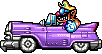
A classic Wario lander, or do you think Starfy 3 got Wario better than Wario did?
What about your least favorite designs?

Discuss below!
 
I'd say:
  1. Goes to Wario Land 1st, mostly because he would the fit the SMW atmosphere
  2. Wario Land 4, because that's when his stands out the most despite borrowing assets from Wario Land 3, an akin to Super Mario World and SMB3
  3. Wario Land 3, look at the amount of frame per second for his animations, it almost looks like he was animated by Nazca
Honorary mention: VB Wario, a detailed version of the first Wario platformer design.
 
This one from Virtual Boy Wario Land:
VBWL-Wario_Barge_Position_Sprite_-redscale-.png

Just look at those muscles!

And this one from Wario Land 4 as well:
Wario_Car_WL4.png

He just looks so cool driving his Wario Car.
I'm glad we have this in our "smilies" inventory.


When I was younger, I always thought he was carrying bombs. :SBlank:
 
Personally would put WL4 in the bottom 3.
Don't get me wrong, he's beautifully expressive, but so much of him just seems... really off. In a scary way.
The teeth look pointy and slipshod; rotten breath may fit the character but Wario always has a marble wall of pristine white teeth. The pupils sometimes cross over into the eyebrows, causing him to have pure white eyes instead of his classic endearing lazy eyes. The blue around the eyes is also emphasized to the point of circling the entire eyelid, rather than being squeezed by the cheekbones; almost as if his cheek muscles are slacking. The corner of his mouth droops along as well, removing all the joy from his typical wide... smile? Grimace?
Definitely think Starfy 3 did a better job with a similar palette and style, though I'm not a fan of the checkered shading used for the teeth here either.
 
Back
Top