Visual Mistakes in Games

Here's what it's supposed to look like:
View attachment 5476Dunno why your version is slightly darker...
They are pretty similar to the Palm Tree Paradise palm trees, just without coconuts.
View attachment 5477

I used the one from the Spriter's Resource sheet because I didn't want to re rip the graphics to merely prove a point for one post. For some reason, the palette seems off there.

But yeah, not sure why it's cut off. The exact same trees look perfect in Palm Tree Paradise...
 
My guess is the artist simply forgot it and due to both the palm tree and the background being dark they never noticed it. From a certain angle it does look like it could maybe be right... I certainly never noticed it as a kid. ^^
And then they just copied the sprite for the other palm trees and never noticed it.
...maybe.
 
  • Like
Reactions: 607
Clipping is pretty much unavoidable in 3D games. However, I can't stand when there's clipping in regularly shown animations. A recent example off the top of my head is how in Mario Kart 8 Deluxe the Inklings' arms clip through their head tentacles in their winning animations.
They did that pretty well in Splatoon 2. I love how Marina's tentacle smoothly floops around her arm when she's dancing. <3 It's mesmerizing. <3
 
  • Like
Reactions: 607
There's always gonna be mistakes in video games. Not even The Last of Us is safe from this?
sddefault.jpg
 
Btw, the WarioWare series has a ton of obvious mistakes.

Like this:
upload_2018-4-1_13-50-10.png

Can you see it? I wouldn't blame you if you can't but there's a gap in Wario's head.
upload_2018-4-1_13-50-56.png
That's the background poking through.
upload_2018-4-1_13-51-56.png
It goes away when Wario changes expressions.

Also, this artwork from Twisted:
upload_2018-4-1_13-52-53.png

It always looked really weird to me... But now I know why!
Wario_WarioWare_Twisted.png
They miscolored him! No, I'm not talking about the color palette, I mean that they turned the gap between in his teeth into his top row of teeth, and turned his top row of teeth into an oversized lip! WHY? It looks so wrong! That HAS to be a mistake!
It's supposed to look like this!
corrected.png


There are a ton of things like this all over the series, especially the early ones, but I can't list them all right now.
Go ahead and list some yourself, if you can think of any.
 
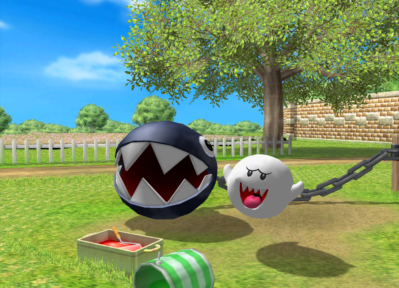
Mario Party 8 has an obvious one:

Atthechompwash2.png


Note anything odd in the background?

Well, that black stuff is actually the void under the level, since the grass and flowers don't connect properly. However, somehow the devs missed that you can actually see it in the level, so yeah, pretty obvious visual error there.

See 1:51 here for more of an explanation:

 
In Barbie in the 12 Dancing Princesses, throughout the game sisters give you dresses that grant special abilities. You can switch between the dresses at any time. The mistake: when Genevieve (the player character) jumps, her mouth turns the colour of her dress. When you're wearing the pink dress, the only one you've got at the beginning of the game, that isn't a big deal, as Genevieve's mouth is supposed to be pink anyway (it does get a bit too dark, though). However, once you wear another dress it really looks quite strange if you pay attention to her mouth. d:p
Here's a video in which you can see Genevieve jump wearing different dresses.
 
Back
Top