Visual Mistakes in Games

ShyGuyXXL

Shyster Guyster
Diamond City Insider
Have you ever seen something in a game that was clearly meant to be different?
Not a graphical glitch, not a badly done sprite, just something that was clearly a mistake by the artists.
Something that was overlooked even though you can clearly see it when you play the game.

For example, this animation in Superstar Saga:
2017-10-07_11-31-54.gif

Luigi's sprite was supposed to be in front of Mario, like this:
Mario-&-Luigi-Hug.gif

The in-game version just looks like Luigi is... making Mario happy. ( ͡° ͜ʖ ͡°)


Some Wario games even have these.
For example, Anonster has one tile that uses Wario's color palette for some reason. (fixed in the lower version)
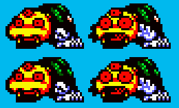
upload_2017-10-7_12-30-25.png


There were other instances in WL3 or 4, I think, but I can't remember them right now.

Do you know any such mistakes?
 
Really doubt it's a hardware limitation. I'm pretty sure it's just to make them stand out more. Link's pink hair in ALttP is another similar example I've seen.
 
hardware limitations
Those words... I don't think they mean what you think they mean.

It's like saying Link's hair is pink due to limitations.
It just makes no sense.
Fact is, in order for Yoshi's arms to become orange, someone must've consciously colored them that way. You don't just accidentally color a whole bunch of very specific pixels a different color.

I'm assuming they corrected it in later games since they didn't want it to be inconsistent.

But I'm talking about something that was really just a mess-up, not a weird artistic decision.

Like how Wario Land 2 has one level where there's treasure behind a wall but they forgot to make the wall breakable.
Or how some sprites are layered differently in the color version, making things look weird. Like how part of the owl's beak disappears every few frames.
 
Wario Land 4 has quite a few tiles which are either blatantly cut off or poorly placed.

Arabian Night's Palm Trees don't look right at all:

cutofftree.png

What on Earth is going on with the bottom leaf to the left?

And Mystic Lake has tons of small tiling errors at around 3:50-4:50 in this video:


tilingerrors.png


Anything in red either doesn't look right or seems completely cut off.
 
To be fair, I could hardly see those tiny bits. Seems like a case of "with so many different tiles it's hard to make them all fit together perfectly".

Or is there a tile that should obviously have been used instead of those?
 
  • Agree
Reactions: 607
To be fair, I could hardly see those tiny bits. Seems like a case of "with so many different tiles it's hard to make them all fit together perfectly".

Or is there a tile that should obviously have been used instead of those?

Nah, it's just likely tied down to either tile limits (how much space do these graphics use for the level?) or it simply being 'good enough' (since most don't notice it).

But that's the case with a lot of visual mistakes in games. As you said, how many will notice the one odd coloured spot on the spider boss' sprite? Or even Luigi not being in front of Mario?

They're things a ROM hack can fix for perfectionists, but for the average Joe, they're non issues.

Still, that's the point of this topic really isn't it? To look at where developers went a little wrong, even in tiny mostly unnoticeable ways. And on that note, here's another one.

Remember Yoshi's Island DS?

Well, as you know it's graphics work wasn't exactly great. It was pretty lazy with shading and sprite design, and felt like they traced or rotoscoped existing art more often than not.

But they also made an obvious mistake with cut off in a secret level too. Can't find a picture, but if you fall in some of the pits in the world 4 extra level, the tiles literally cut off before the bottom of the screen. It looks really bad.
 
This is not really something too noticeable or that it affects too much, but i noticed how Ocean Prince is missing one of his "arms" on the second screen of the DS version of Puyo Puyo Fever 2, as seen i this image.
UtarYoZ.png

The left one is his second screen sprite, while the right one is his artwork, what he is supposed to look like, i found pretty intersting to see something like this in that game, also, this was later fixed in the DS version of 15th Annivesary.
Fkb2zTh.png

I think i know the reason why does this mistake happened, it may have something to do with his Fever 2 cutscenes sprite, as seen here:
KiHa176.png

Notice how his "arm" is detached from the rest of his sprite, the reason for that is for him to be able to do a little animation moving that arm, i think the one who did the second screen sprite just grabbed the sprite from there and forgot about his other "arm", it's kinda strange as this does not happend with any of his other sprites.
 
I apologize, I really want to find something,
But I couldn't nor can I really think of anything, so I instead just thought of the first thing I can think of that I feel like could be related. (Hence the orange arms)
But instead, all it did was make me look like an stupid idiot
And thus completely embarrassed myself.

So i'm sorry

Edit: Just ignore this please and continue the discussion, I apologize for derailing the topic.
 
Last edited:
I apologize, I really want to find something,
But I couldn't nor can I really think of anything, so I instead just thought of the first thing I can think of that I feel like could be related. (Hence the orange arms)
But instead, all it did was make me look like an stupid idiot
And thus completely embarrassed myself.

So i'm sorry
Dude, it's really not a big deal and it certainly didn't make you look like an idiot, no need to beat yourself up over it.
 
  • Friendly
Reactions: 607
So let me try this again and rerail the discussion.
There is one case of a possible oversight though that comes to mind
Now I don't know if it counts or not,
The original Green Hill in Sonic 1 tends to have occasional little mistakes like misplaced titles and shit,
Not major ones, mind you, but ones that can be noticeable with a keen enough eye
What do I mean exactly though?
green_hill_zone_background_1_by_sonicmechaomega999-d9uisrx.png

You see those mountains in the background, now some of them have gaps in them like most mountains do, however if you look at some of them
Some of the tiles are actually misplaced.
Here's what I mean
green_hill_zone_background_1_by_sonicmechaomega999-d9uisrx.png (Error).png

And this is what it was supposed to look like for example.
green_hill_zone_background_1_by_sonicmechaomega999-d9uisrx.png (Fixed).png


Now of course it's a very minor case and one that's actually kept in Mania (Athough filled with Waterfalls)
NintendoSwitch_SonicMania.jpg

So I'm not sure if this would count as a "mistake" in this context as it's probably not.
But it's probably the closest thing I can find to one.
 
Last edited:
So let me try this again and rerail the discussion.
There is one case of a possible oversight though that comes to mind
Now I don't know if it counts or not,
The original Green Hill in Sonic 1 tends to have occasional little mistakes like misplaced titles and shit,
Not major ones, mind you, but ones that can be noticeable with a keen enough eye
What do I mean exactly though?
View attachment 5427
You see those mountains in the background, now some of them have gaps in them like most mountains do, however if you look at some of them
Some of the tiles are actually misplaced.
Here's what I mean
View attachment 5428
And this is what it was supposed to look like for example.
View attachment 5429

Now of course it's a very minor case and one that's actually kept in Mania (Athough filled with Waterfalls)
View attachment 5430
So I'm not sure if this would count as a "mistake" in this context as it's probably not.
But it's probably the closest thing I can find to one.

I'd say it'd count. It's like the wrongly placed/missing tiles I mentioned in Wario Land 4. Minor graphical mistakes by the developers that most people would never notice.
 
If there's a tile that's already in the files that would obviously fit much better then, yes, I'd say it's a mistake. But if they would have to make a new tile to make it fit then maybe it wasn't.
 
  • Agree
Reactions: 607
I remember the All Stars remasters of SMB1/LL and 3 having cutoff for the tiling work in quite a few instances. Guess they just thought kids wouldn’t notice?
 
You mean like this?
upload_2017-10-9_22-46-3.png

Yeah, I agree, it's not pretty. They should've either put the water on another layer or made another pipe sprite with blue pixels on the side.
But it's still more laziness than an oversight or a mess-up.
I'm sure they were aware of it but didn't bother to improve it.
 
  • Agree
Reactions: 607
Back
Top