You are using an out of date browser. It may not display this or other websites correctly.
You should upgrade or use an alternative browser.
You should upgrade or use an alternative browser.
The Mega Man series
- Thread starter warelander
- Start date
-
- Tags
- nana is my waifu
- Coins
- 16,894
Yah know as overplayed as Mega Man 2's Wily theme is, I still can't help but love many of the things that have been done with it, like this:
Had this one on my mind, when seeing a post about the new cartoon on my Tumblr dashboard, since this quite frankly, sounds like it would be a perfect fit for a Classic Mega Man Anime main theme.
Had this one on my mind, when seeing a post about the new cartoon on my Tumblr dashboard, since this quite frankly, sounds like it would be a perfect fit for a Classic Mega Man Anime main theme.
- Coins
- 6,296
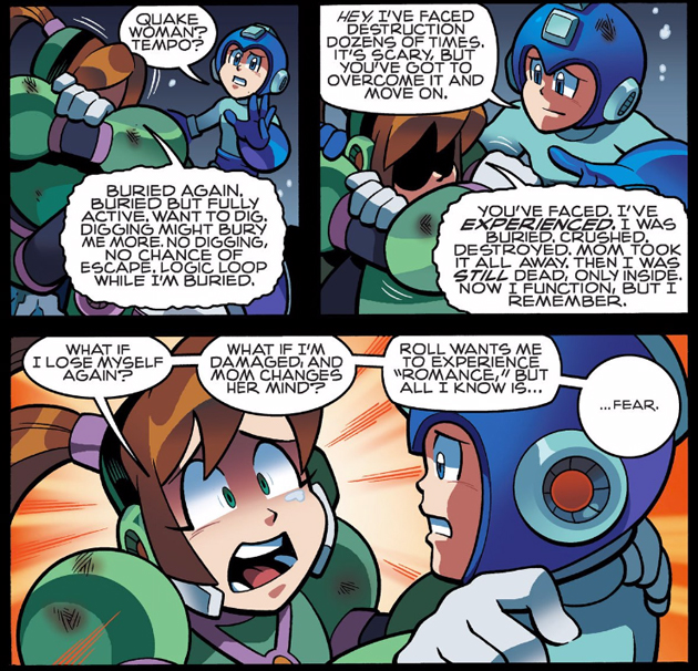
I look at the upcoming cartoon and...I'm not sure whether to be happy or sad that the makers remember the Dreamwave comics.
And then they decide to deviate from even that version by adding Mega Mini and changing Rock's name to Aki. Beautiful. Looking to be the best adaptation ever...and by that, I mean that it's not looking good.
At least they didn't adapt the Brazilian comics; that would have been even worse than what we're getting now.
At least they didn't adapt the Brazilian comics; that would have been even worse than what we're getting now.
You telling me you wouldn't want BIG MACHO WILY animated?
Or the dreaded " neomavericks "
- Coins
- 6,296
Probably not. I think loosely adapting the Dreamwave comics (itself already a very loose adaptation at best) was the lesser of two evils.
- Coins
- 16,894
Maybe it's because I have never seen anything from Man of Action, but even with the odd premise I'll be going into the show with a neutral mindset, if it's along the lines of the Sonic Boom cartoon, where it's not particulary spectacular, but fairly entertaining, then I'd be alright with it.
Very picky when it comes to cartoons, already to me it looks really meh. The art style is ugly as well then I remember shows such as Sonic Boom where the audience aren't the people who grew up with Sonic but children of the present. So who knows this might actually help gather younger fans or it might flop on it's ass, either way it'll be entertaining to see what becomes of it. Screw mega mini however.
With Megaman you don't even have to create an expansive world. You got all the right elements from the games, the rockman killers, rms, wily castle. It could be something similar to the SMB3 show where they mostly went on whatever adventures through out each world.
- Coins
- 16,894
Pretty much, Classic Mega Man already has enough elements that could carry a show quite easily, makes me wish we just got a straight forward adaption, similar to the Archie Comics (even though those still had original elements), but to be honest I wasn't expecting the show to be that from the very start.
Never liked Archie, mostly since it's more of this weird fanon related stuff. If the cartoon would go that route it'd at least help give the younger audience a chance at knowing what Megaman is even if it's awkward.
There's been a commercial out for the new Megaman cartoon however it's been taken down on YT so here's two more screenshots. Megaman is looking very Astro Boy like, it really isn't like the Archie Comics look it's got a sleeker realisticy creepy look to it.
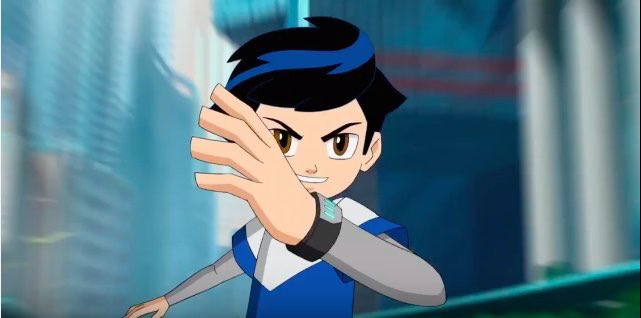
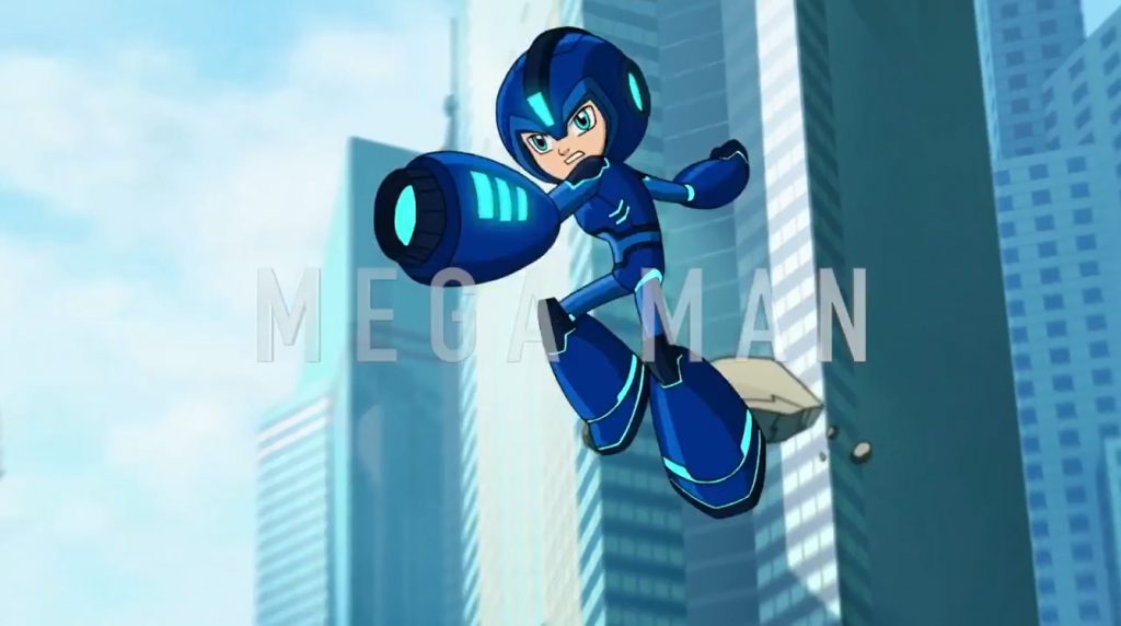
There's been a commercial out for the new Megaman cartoon however it's been taken down on YT so here's two more screenshots. Megaman is looking very Astro Boy like, it really isn't like the Archie Comics look it's got a sleeker realisticy creepy look to it.
- Coins
- 6,296
Wasn't really a fan of what I already saw of Man of Action's work, and honestly, I can't say I'm looking forward to this.Maybe it's because I have never seen anything from Man of Action, but even with the odd premise I'll be going into the show with a neutral mindset, if it's along the lines of the Sonic Boom cartoon, where it's not particulary spectacular, but fairly entertaining, then I'd be alright with it.
I enjoyed Archie's Mega Man comics, even if it had many original elements (and I actually liked those). Then again, it was my start to Mega Man, so take this opinion as you will.
But with that in mind...I just can't be too excited for the cartoon. Then again, when I heard the makers of the Ultimate Spider-Man cartoon were handling this, I didn't really have much faith to start with.
- Coins
- 16,894
I'm sure everyone here already knows this, but:
Not gonna lie, I'd love to know how the cartoon would have turned out if this version got picked up, beyond just two minutes of promo footage.
Not gonna lie, I'd love to know how the cartoon would have turned out if this version got picked up, beyond just two minutes of promo footage.
- Coins
- 16,894
Saw and reblogged this yesterday on Tumblr and I friggin' love it:
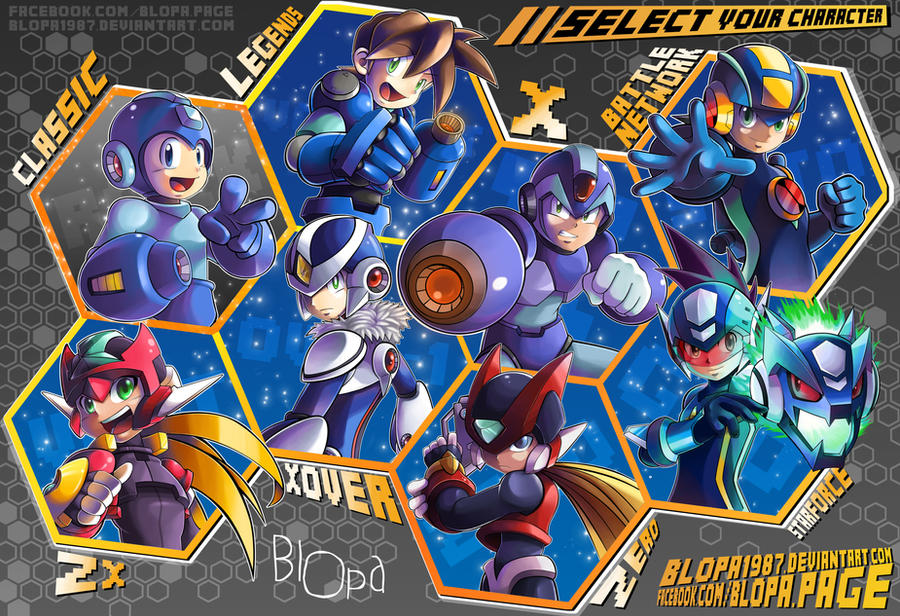
http://blopa1987.deviantart.com/art/Select-your-character-536119050

http://blopa1987.deviantart.com/art/Select-your-character-536119050
- Coins
- 14,372
Like the art but Classic MM seems out of place, maybe its his gray background compared to the other blue ones or perhaps his roundness but he just seems distinct to the rest in neither a good nor bad way. This artist is certainly great though.
- Coins
- 16,894
To be fair, that's entirely intentional, since the art is supposed to look like a character select screen and the courser happens to be on Rock, hence why he sticks out.Like the art but Classic MM seems out of place, maybe its his gray background compared to the other blue ones or perhaps his roundness but he just seems distinct to the rest in neither a good nor bad way. This artist is certainly great though.


