- Coins
- 16,009

As it should be
Swell.


As it should be
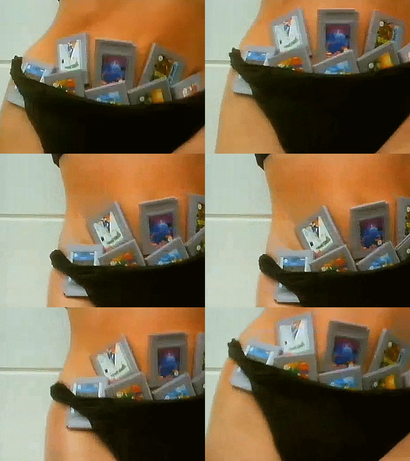
What's this?In order to get the perfect girlfriend, you must ask her if she got Wario land under her panties.

rip hugh hefner (drowned in the pussy)
An animated gif. But that doesn't get me anywhere. I wonder where it's from, and what its meaning is.Take a guess.


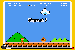
You know, I always wondered whether nintendo has some sort of digital library containing all the sprites (and music and other things) that have ever been in their old games, so that when things like this are made, they DON'T need to resort to using fanmade emulators or taking sprites from sprite rip sites.
Guess that wasn't the case.
You know what always bothered me? These background sprites...
At first I thought they just made a mistake, but no, they are ALL slightly squashed. Even Mario's feet have been cut in half.
Weirdly tho the goomba is still 16x16 pixels.

View attachment 5749 Ignore the color differences. Not sure which one is more accurate. I've seen so many different color palettes for this game that I don't know what's right anymore.
I know that the GBA's screen is smaller than that of the NES... but this just looks weird. I'd rather just lower the interface than squash the sprites we're all so familiar with. It's not like you need that much space to jump on a goomba.
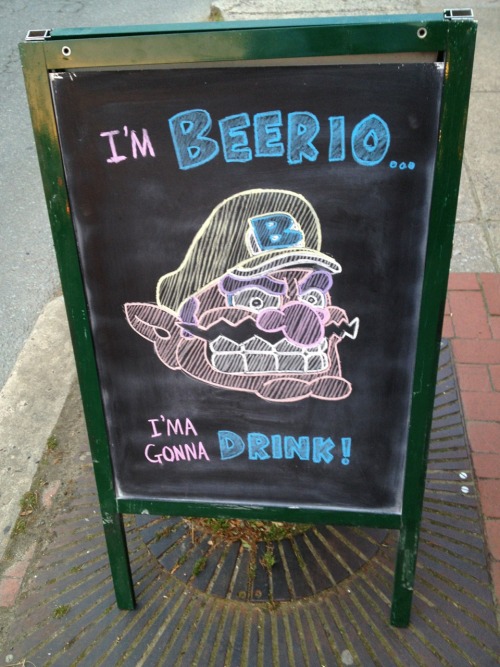
German Wario strikes again!


I haven't heard of that. Moreover, Super Mario Bros. wasn't in the Super Mario Advance series, having already been remade on the GBC.This can be seen in the SM Advance series too. Some levels are even altered (obstacles replaced etc.) to fit the GBA's screen better.
*ported.remade

Aren't they just straight emulations with a weird screen resolution?*ported.
Has anyone here ever played any of the NES Classics ports on the GBA? Nobody ever talks about those...

